Building a Modern Scheduler (II)

2024-05-15

This article is the second in a series in which we explore the discovery and development process for a feature at Bold. You can read the first article here.
Competitor analysis
Since we’re neither the first nor the last to develop a scheduler, the first thing to do is take a look at the competition to understand what kind of user interfaces they offer. To sum it up: Gantt charts everywhere.
The first thought that crosses my mind is whether we can do something that breaks completely with what already exists. However, after thinking it over, it’s hard to find a visual representation of many resources across a time horizon that improves on the Gantt chart.
Capturing user feedback
This isn’t a matter of giving up at the first hurdle; it’s time to capture feedback from users of this kind of tool to see whether we’re missing something. We reach out to contacts, customers, or even potential customers—anyone who has the problem and is willing to talk about it.
I mainly took away two insights from this process: first, that the Gantt chart works, and second, that the key lies in the information you need to decide whether to schedule a production order earlier or later.
Limitations of the Gantt chart
A Gantt chart offers limited ways to display information. Displaying it as text makes everything difficult to understand because the Gantt bars are small, and the amount of text you can show is limited. That leaves us with only two ways to display information: the bar color and tooltips.
Tooltips can work for expanding information on a case-by-case basis, but they can’t be the basis for making decisions, since you have to move the mouse to see them and they don’t work well on touch devices.
There are many dimensions of information that may be needed to make decisions, but color limits us to one, or at most two if we split the bar horizontally or use multicolored patterns.
This means we need a simple way to change which dimension we want to see, so we can quickly review the schedule using different dimensions.
Proposed solution
Once we’re clear that we’re going to build a Gantt chart, we still need to think about the actions the user will be able to take beyond simply moving the bars.
These actions should be represented in our API. At this point, I think you have two options: start by designing your backend and your data, or simply start by thinking about the actions from the user’s point of view and worry later about whether they fit.
The second option sounds better, but if you completely ignore the big picture, you’ll probably run into obstacles during implementation.
To avoid that, I try to reconcile the backend and frontend in my head, but it’s complex. The alternative is to build things gradually, iterating and adjusting before it’s too late (and more costly).
Necessary actions
In any case, the conclusion for the scheduler is that we need at least four actions:
- Update production order data: I considered updating it in real time, but the complexity scales considerably and causes strange effects in the schedule.
- Find a solution: that is, use an algorithm to calculate an optimal solution.
- Save changes made by hand.
- Apply target dates: that is, turn a tentative plan into reality.
Initial prototype
With this, we have enough to start building a prototype, which would look like this:
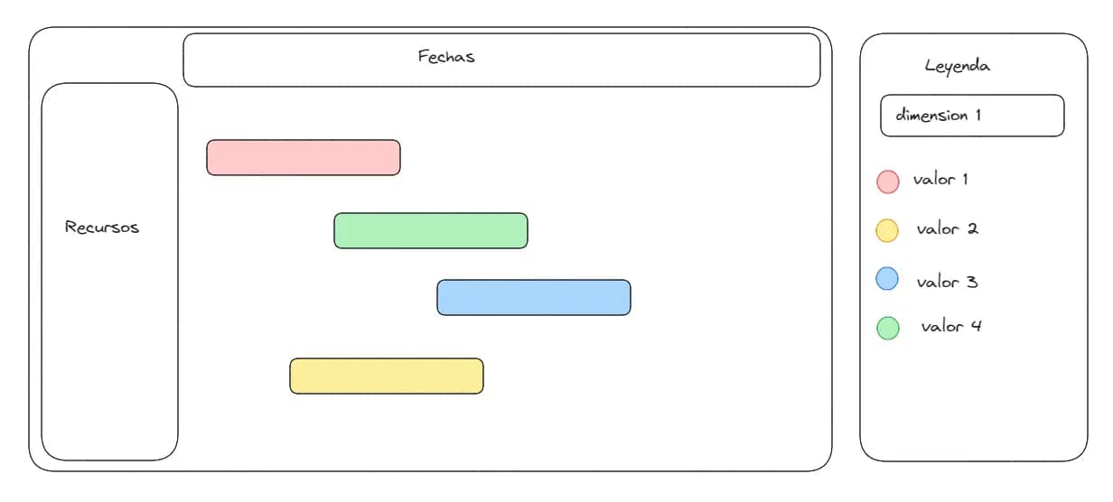
We get started, and the first question is whether there’s already a Gantt chart for React that we can use. After exploring the features they offer, it seems they won’t be enough, so we’ll have to build one from scratch.
I’m concerned about performance, so the first thing I do is build a PoC with fake data to see how well a Gantt chart works with thousands of operations. After validating this and playing around with this test data, I realize I’m missing information to make decisions.
For example, how do I know which operations are violating precedence constraints? Or which ones are causing my orders to be delivered late?
Besides displaying this as a visual indicator on the bars, I need to expand that information and easily see how many there are in each status.
Expanding functionality
After a few hours of coding, we get something like this.
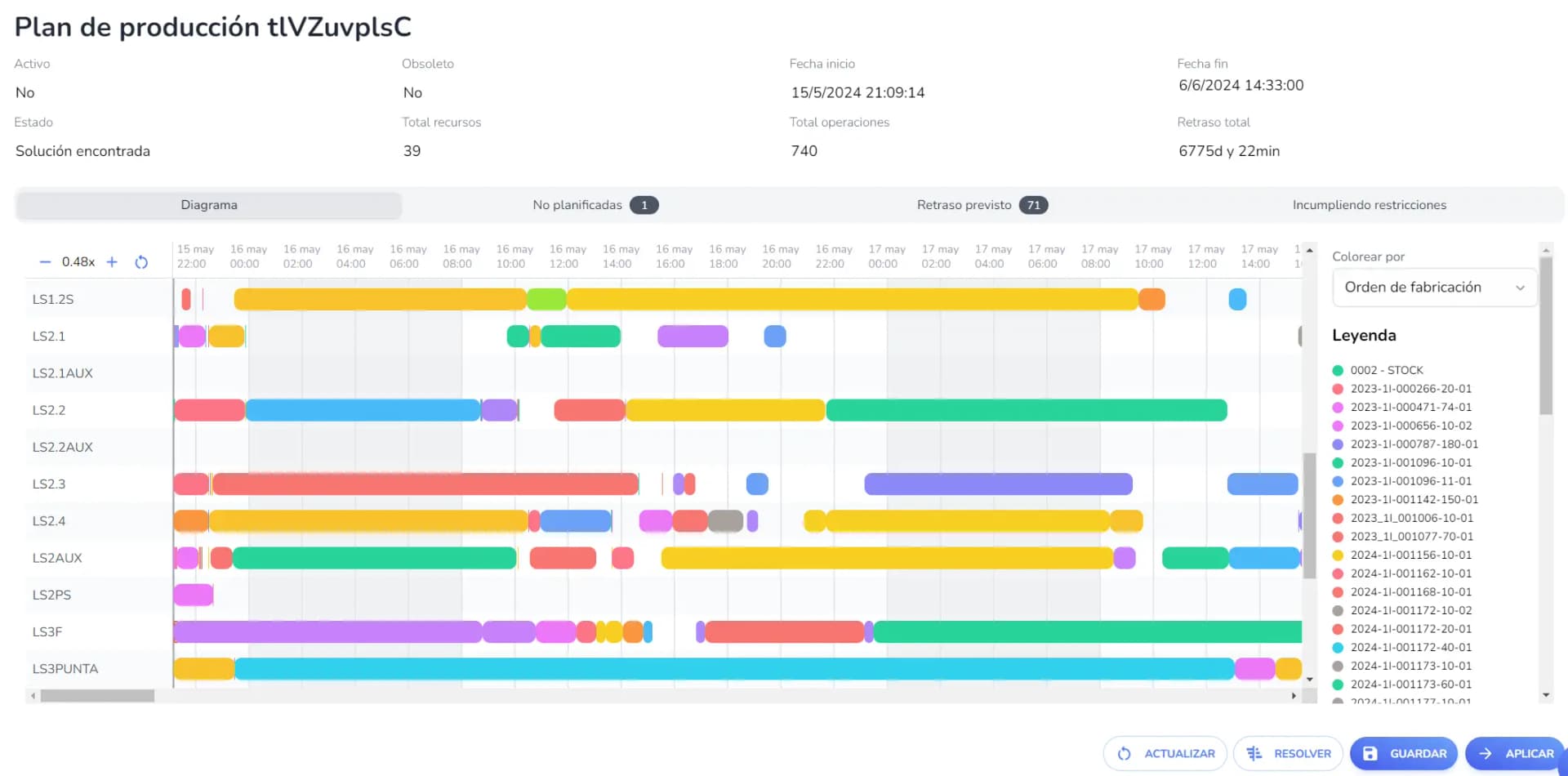
It’s still not perfect, but it’s functional, so it’s time to move on to the backend and make this actually work.
Next week, we’ll explore the scheduling algorithm, a key component in optimizing our operations and offering unique value to our users. Don’t miss it!